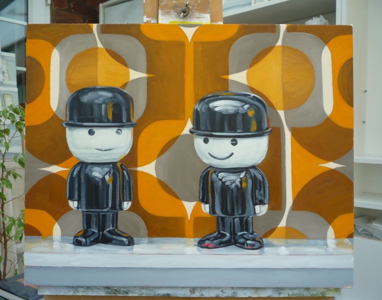
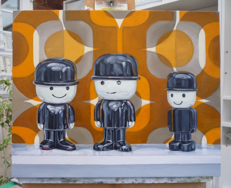
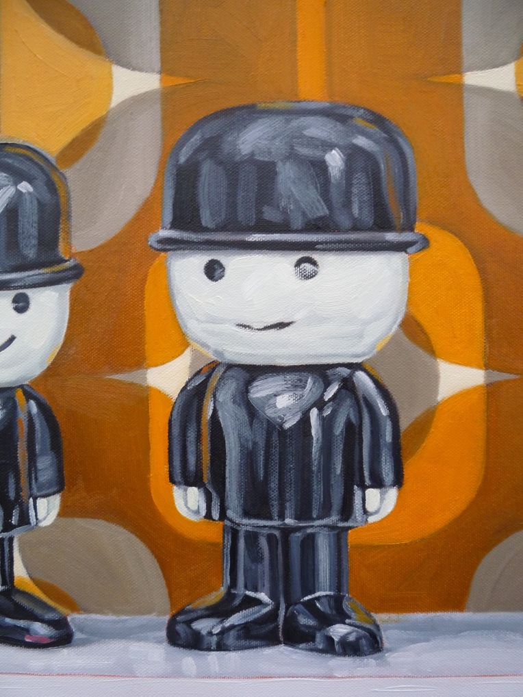
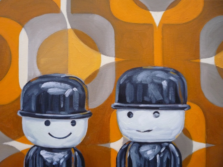
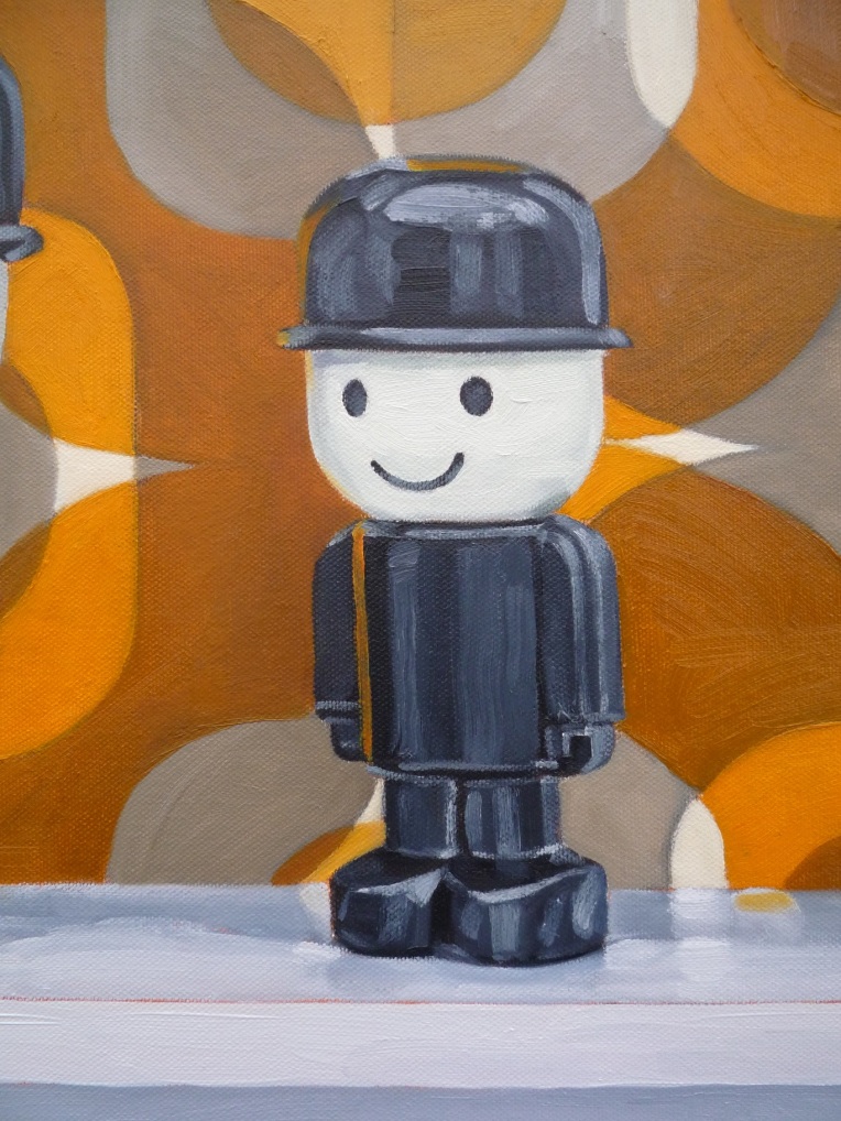
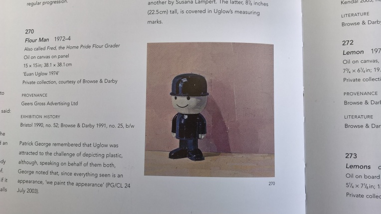
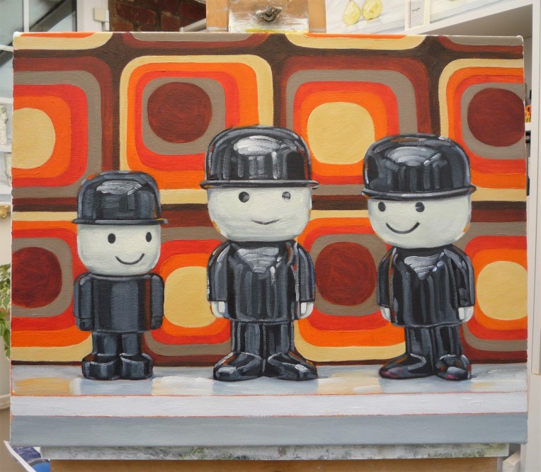
Returning to the subject matter of the ‘Homepride Fred-the flour-grader’ compositions, this one again featuring an arrangement of all three of the iconic figures in the collection, arranged against a ground of a hand-drawn-and-painted approximation of a Dekoplus fabric design of 1960s vintage that might be said to make a nod toward the similar device of the representation of bold wallpaper patterns employed by Patrick Caulfield as an element of the complex visual language of his paintings: the ghost of Euan Uglow always haunts the painting of the ‘Freds’, of course.
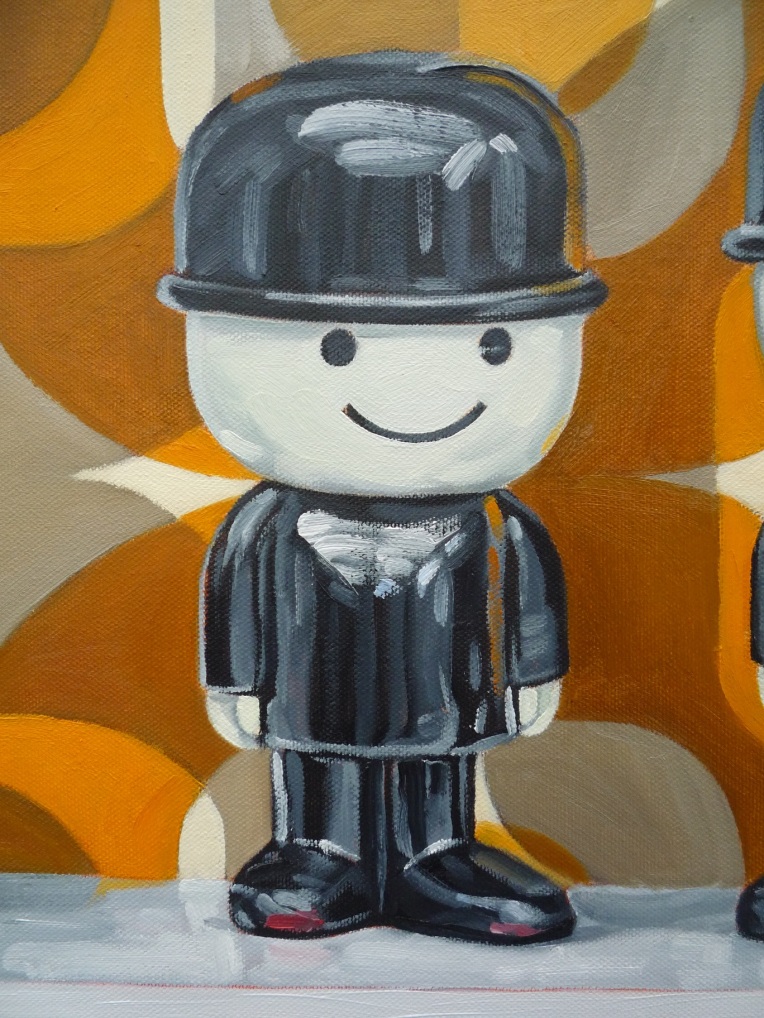
As always, the play of natural light over the plastic surfaces of the objects and the manner in which fleeting little ‘pings’ of reflected colour occur, with the challenge of recording them, is a constant delight in the process and reason enough to continue mining this particular seam of pictorial interest. Additionally, a little light research has unearthed the discovery that the Homepride ‘Fred’ character – advertising icon to-be – was ‘born’, being the idea of Bobs Geers and Gross, in 1964, the very year of my own birth, so that feels like another connection, however tenuous and arbitrary.
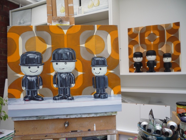
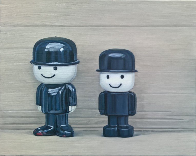
‘Three Homepride Freds and Dekoplus Design’
oil and graphite on canvas/16″ x 20″/April 2019
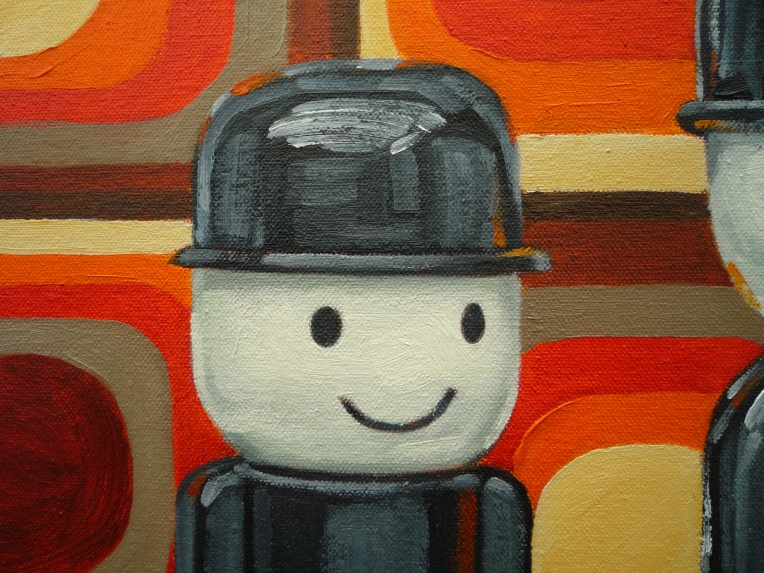
[detail]
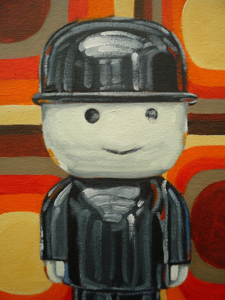
[detail]
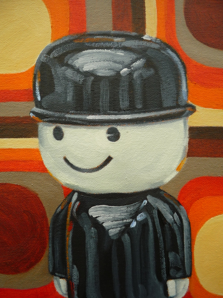
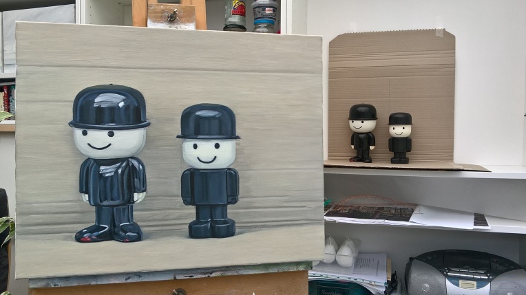
[detail]
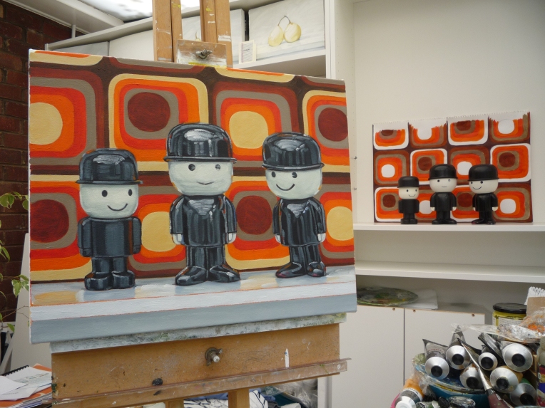
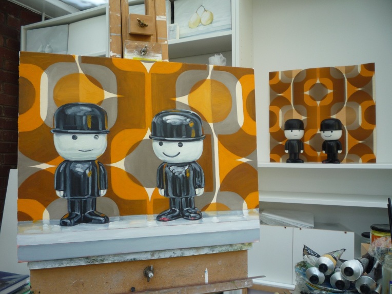
The finished painting on the easel in front of the composition, as painted