Half an Update…

The recent absence of blog updates does not mean hands have been idle by any means, and the drawings for the Seventies project have continued at a regular pace as will now be illustrated.

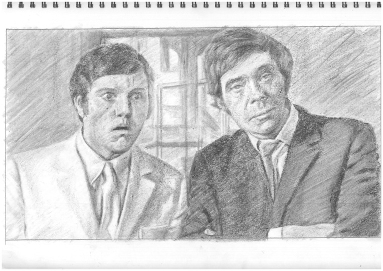
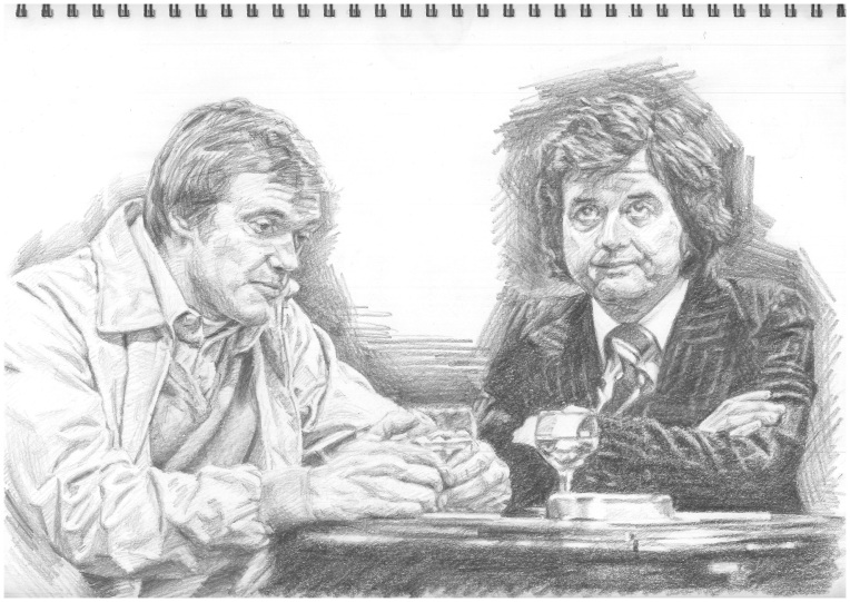
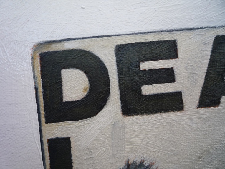
First of all, and continuing with the Northern theme that had been developing within the project, a double portrait drawing – also incidentally incorporating a still life element – from a source image that nostalgically recalls the early evening local television news programme that was broadcast into our homes in the north east corner of Wales, courtesy of the transmitters that brought us Granada TV rather than its Welsh equivalent (for which we required a special aerial adaptor that still proved unreliable). Thus are depicted two of the presenting team of ‘Granada Reports’ in its mid-1970s’ heyday, a young Tony Wilson as apprentice to the legend that was and remains Bob Greaves, with all fashions of the day on display.

TonyWilson_BobGreaves_GranadaReports

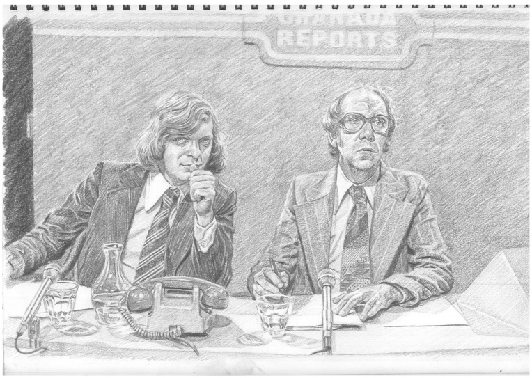
Tony Wilson and Bob Greaves, ‘Granada Reports’ 1970s

graphite and putty eraser on ‘Seawhite’ cartridge paper/42 x 30cm

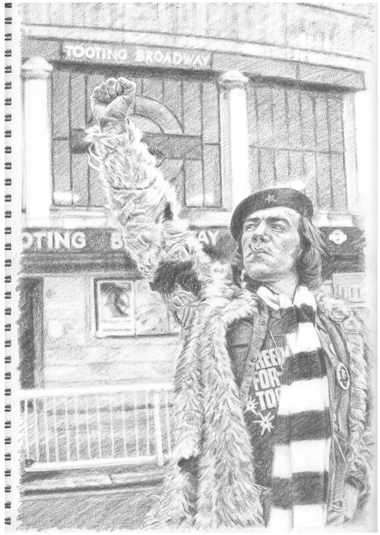
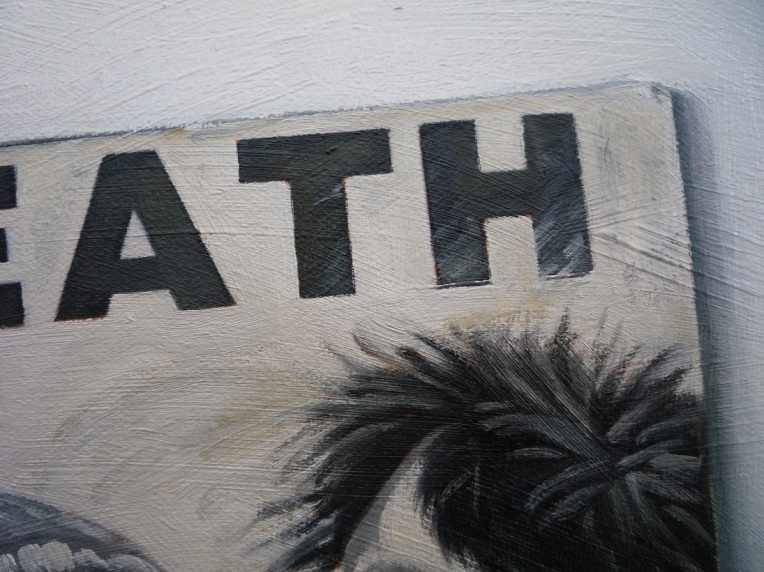
Next, the hip, young cultural gunslinger Tony Wilson is his other contemporary television presenting guise as more casually-attired host of ‘So It Goes’, introducing new music to the north west region, including a selection of the punk and post-punk bands from Manchester and environs that had been formed and developed in the wake of the Sex Pistols’ legendary appearances in the city in 1976. As ‘So It Goes’ fell victim to a notorious appearance by Iggy Pop at the conclusion of its second series, so Tony Wilson’s dissemination of the new sounds found other outlets, within ‘Granada Reports’ and also, of course, with the founding of Factory Records, both of which came to feature Joy Division as they grew and became such an icon of the time and place, and proceeded to transcend both as they remain synonymous with.

TonyWilson_SoItGoes

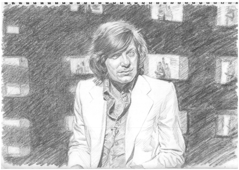
Tony Wilson, ‘So It Goes’

graphite and putty eraser on ‘Seawhite’ cartridge paper/42 x 30cm

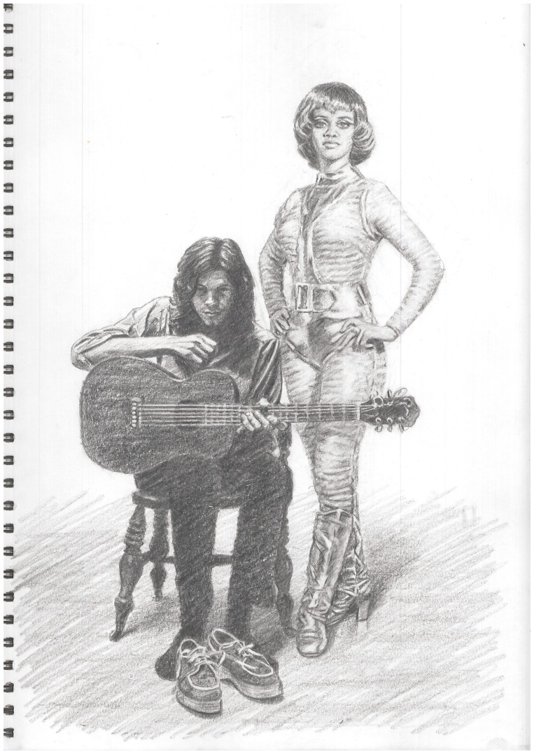
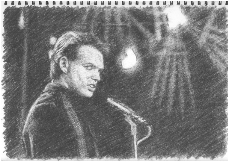
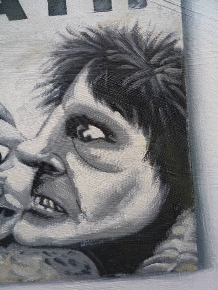
The recently-published volume of Paul Slattery’s photographic record of Joy Division at Strawberry Studios and around the town of Stockport on 28th July, 1979, features the source image for this drawing on its cover. ‘Here are the young men’ indeed, but creating some of the most powerful and resonant music of the era. If I’m absolutely honest, I didn’t acquire my first Joy Division record, the ‘Transmission’/’Novelty’ 7” single, until the February of 1980, after which obsession took hold, but the seeds of my devotion to them had undoubtedly been sown in my soul during the previous autumn, via the auspices of the John Peel radio programme (of course), so their inclusion in the project is entirely appropriate.

JoyDivision1979

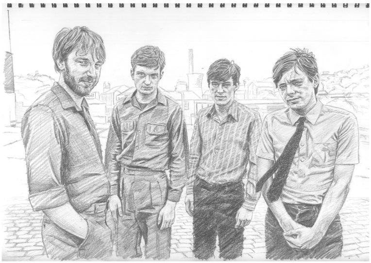
Joy Division after a Paul Slattery photograph

graphite and putty eraser on ‘Seawhite’ cartridge paper/42 x 30cm

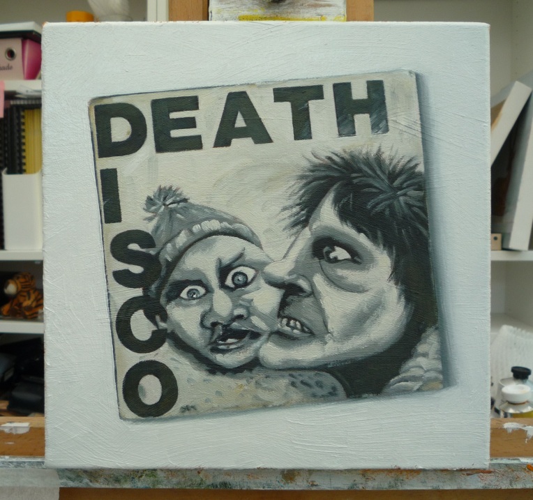
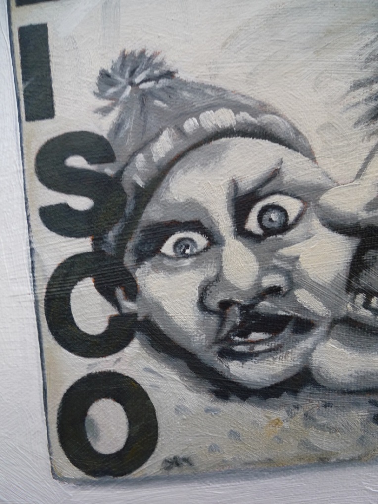
More musicians pictured standing (and squatting) around can be found on the cover of The Stranglers’ (my very favourite group of the time) ‘Black and White’ LP, and this image, along with the band’s iconic logo, that I would have drawn/copied often then, forms the content of the next drawing which, in effect, illustrates one of the three music albums that I received as presents for Christmas 1979 (so we’re really pushing at the limits of the Seventies here!).

TheStranglers_BW

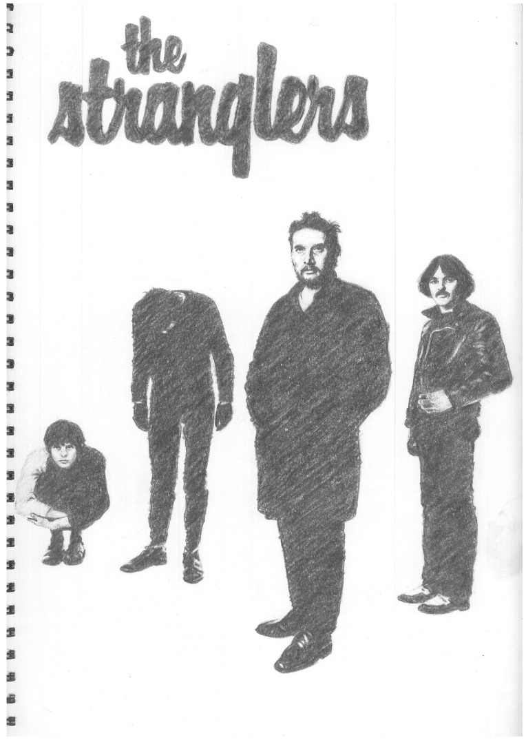
The Stranglers ‘Black and White’

graphite and putty eraser on ‘Seawhite’ cartridge paper/30 x 42cm

The others were Public Image Ltd’s ‘Metal Box’, originally released as a collection of three 12” vinyl EPs contained within a tin canister (as very sadly I no longer own this object of desire, the substitute utilised as the model for this still life is in fact the reduced-circumstances and feeble impostor CD-sized version of the can, but I’d like to feel the spirit of the original can be inferred from the representation) – I have blogged about this on a previous occasion – and The Clash’s masterpiece double LP, ‘London Calling’, the front cover of which is faithfully reproduced in pencil here. In time, one learnt of the genesis of the latter artefact’s design, by Ray Lowry, in the artwork accompanying Elvis Presley’s debut album, and of such concepts and practices as artistic influence and postmodern ‘appropriation’, but I’m sure that wasn’t of particular concern to my 1979 self!
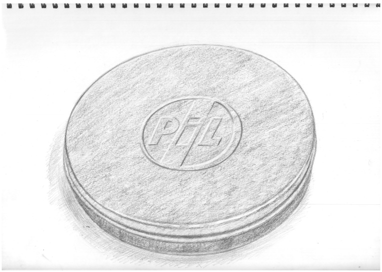
MetalBox

‘Metal Box’

graphite and putty eraser on ‘Seawhite’ cartridge paper/42 x 30cm

TheClash_LondonCallingLP

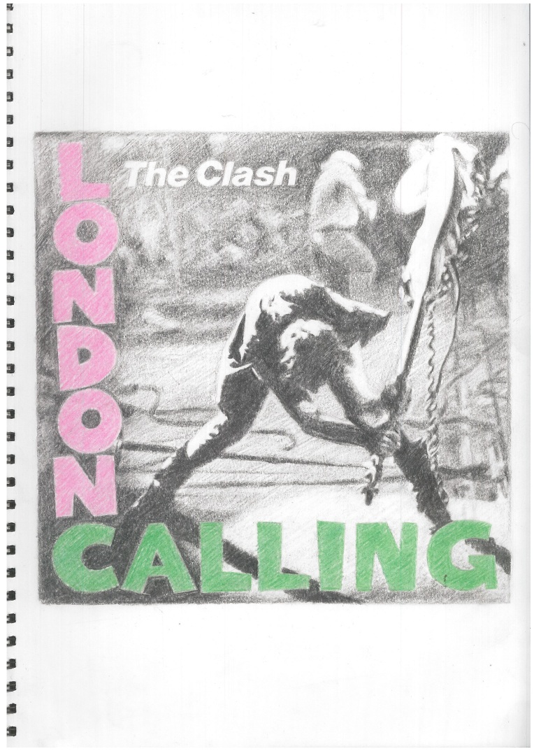
‘London Calling’ LP sleeve (front)

graphite and putty eraser on ‘Seawhite’ cartridge paper/30 x 42cm

Post-Yuletide Update

One of the benefits of the holiday-from-the-day-job season, at least in academic circles, is a two-week break that, among other things, allows more quality time, some of it even during daylight hours, to get some painting and/or drawing done, and this year I’ve used such opportunity to continue with the Seventies project.

The first drawing to be processed follows on from the previous one of ‘The Protectors’ in that it features a pair of representations of the picture sleeves of the 7″ vinyl record of Tony Christie‘s ‘Avenues and Alleyways’, which song provided the memorable theme tune to that particular television series. This still life is in fact something of a concoction, with images of the respective record covers sourced from the internet, drawn from prints of the images and then transformed into objects with reference to an arrangement of two physical 7″ single records in picture covers, the random choice of which, in terms of the music contained within, are individually and collectively about as far from the Christie song and production as it’s possible to imagine, even if all three are enduring classics of their kind!

TonyChristie_AvenuesAlleyways

‘Tony Christie “Avenues and Alleyways” 7-inch Picture Sleeves’

coloured pencil and putty eraser on Seawhite cartridge paper/42 x 30cm

AvenuesAlleyways_StillLifeComposition

still life composition for ‘Avenues and Alleyways’, featuring the 7″ picture sleeves of Cabaret Voltaire’s ‘Nag Nag Nag’ and the Gang of Four’s ‘Damaged Good’ EP

After ‘The Protectors’, one remembers the capers of Roger Moore and Tony Curtis as Lord Brett Sinclair and Danny Wilde, ‘The Persuaders!’ and the private detective team of ‘Randall and Hopkirk (Deceased)’ as played by Mike Pratt (on the right of the image represented in the drawing) and Kenneth Cope in white-suited ‘ghost’ mode, both of which series obviously kept me interested and entertained enough to remain in the memory bank.

ThePersuaders

‘The Persuaders!’

graphite and putty eraser on Seawhite cartridge paper/42 x 30cm

RandallHopkirkDeceased

‘Randall and Hopkirk (Deceased)’

graphite and putty eraser on Seawhite cartridge paper/42 x 30cm

‘Randall and Hopkirk (Deceased)’ was remade in the 1990s starring north east Surrealist duo Vic Reeves (Jim Moir) and Bob Mortimer and this geographical and regional accent fact inspires thoughts of the Newcastle-set ‘Whatever Happened to the Likely Lads?’, which was a 1970s sequel to the original Sixties British television sitcom ‘The Likely Lads’, both starring James Bolam and Rodney Bewes, and also spawned a feature film that I recall with more clarity than others and again featured a memorable theme song including the lyric “It’s the only thing to look forward to, the past”, of particular resonance in the context of the Seventies project! The Likely Lads certainly seems to have remained an enduring favourite, a significant part of British popular culture and represents a vivid marker of its times.

WhateverHappenedToTheLikelyLads

‘Whatever Happened to the Likely Lads?’

graphite and putty eraser on Seawhite cartridge paper/42 x 30cm

‘Billy Liar’ is a fictional character who’s long held a place in my affections, via Keith Waterhouse’s novel (and its ‘…on the Moon’ sequel) and the 1960s film starring Tom Courtney in the title role, who I always ‘imagine’ since, but I have a dimmer recollection of my first exposure being in fact a Seventies’ sitcom production, thus the drawing below features the actor Jeff Rawle in the eponymous role, represented as one of Billy’s heroic imaginary alter-egos, the President of Ambrosia or somesuch.

BillyLiar

‘Billy Liar’

graphite and putty eraser on Seawhite cartridge paper/30 x 42cm

Finally, another sitcom dreamer, ‘Citizen Smith’, as played by Robert Lindsay, one of whom’s revolutionary rallying cries, “Power to the People”, seems so grimly ironic  in the light of the recent UK General Election resulting in the grotesque travesty of ‘the People’s PM’ representing ‘the People’s Government’, having been returned by a significant enough proportion of an ignorant and deluded electorate – I could rant on at inordinate length of my disgust and fear at the turn of political events in the UK but will end for now and remain focused on the creative, for it’s all we have left.

CitizenSmith

‘Citizen Smith’

graphite and putty eraser on Seawhite cartridge paper/30 x 42cm

Doubling- and Tripling-up on the Portraits

Nick_and_Gabrielle_Drake_1971

‘Nick and Gabrielle Drake, 1971’

graphite and putty eraser on ‘Seawhite’ cartridge paper/30 x 42cm

Having laid firm foundations and taken root now, the Seventies project continues, on this occasion with an invented double portrait, of brother and sister Nick and Gabrielle Drake as they appeared, independently, in 1971 – Nick as photographed for and depicted on the sleeve of his ‘Bryter Layter’ LP and Gabrielle in costume for a promotional image for the ‘UFO’ television series in which she occasionally featured that and the preceding year (see also previous entry).

Following that, a triple portrait, of the actors Tony Anholt, Robert Vaughn and Nyree Dawn Porter as they appeared in character as Paul Buchet, Harry Rule and Contessa Caroline di Contini – ‘The Protectors’, an international crime-fighting agency/team, another television series I recall watching and obviously enjoying as a boy in the early Seventies, which, it transpires, was another Gerry Anderson (co-)production, following on from ‘UFO’. This programme also had a particularly memorable theme tune, ‘Avenues and Alleyways’  – performed by Tony Christie, who had numerous hit records around that time – which is probably something that should also be acknowledged within the scope of the project…

TheProtectors

‘The Protectors’

graphite and putty eraser on ‘Seawhite’ cartridge paper/42 x 30cm

Adventures in Sci-Fi

UFOcharacters

‘UFO’

Graphite and putty eraser on ‘Seawhite’ cartridge paper/42 x 30cm (A3)

Following on from the previous entry, the drawing above also features among its cast of human subjects the actress Gabrielle Drake, on this occasion represented in character as ‘Lt. (Gay) Ellis’ as she appeared in the early 1970s British television series ‘UFO’, which I recall as being a particular favourite of my young self at the time, quite possibly to the point of obsession, as I know I numbered among my substantial collection of ‘Dinky’ toy cars (a definite obsession) the range of three vehicles that were merchandised from the show, including the gold car of the platinum blond ‘Commander Ed Straker’ (played by Ed Bishop), who forms the central figure of the trio depicted. The portrait to the right is of the magnificently and memorably-named Vladek Sheybal, in his role of ‘Dr Doug Jackson’, who, in a curious coincidence, is recorded as appearing in 10 episodes of the total of 26 produced, as is/was Gabrielle Drake, who I must admit I had no recollection of, unlike her role in the previously-referenced ‘Kelly Monteith Show’: apparently, Drake and Sheybal only featured in 2 episodes together, 1970’s ‘Kill Straker!’ and the following year’s ‘Ordeal’.

I think it’s highly-probable that the attraction to Vladek Sheybal’s name was the precursor to my undimmed devotion to those of East European football clubs, easily imaginable as it is that it should belong to, for example, the surprise Bulgarian Cup winners of 1973 who subsequently made an obscure appearance in the following season’s European Cup-Winners’ Cup, perhaps going out of that much-missed competition after a hard-fought and unlucky defeat to AC Milan at the Second Round stage.

Whatever, ‘UFO’, however deeply buried in the recesses of the mind and undisturbed for many years, maintains its presence in the memory and the Seventies project has allowed it to see the light of day once again.

By those curious connections the mind whimsically makes, of its own accord, Ed Straker’s dyed blond hair referenced that of Gary Numan, pictured similarly on the cover of Tubeway Army’s ‘Replicas’ LP from 1979. Now, this was something of a surprise at the time as I distinctly recall seeing Tubeway Army making what was quite possibly their debut appearance on ‘Top of the Pops’, performing ‘Are ‘Friends’ Electric?’ one Thursday evening during the Spring of 1979 – it sparked something of a pro/con debate in John Rogers’ English class in school the following morning, I’m back there in the room – featuring a jet black-haired Numan as the front man, and it is this memory that forms the inspiration for the following drawing in the project, represented from a still taken from a still of a ‘Top of the Pops’ broadcast. Vividly remembered days, of youth, indeed.

GaryNumanTubewayArmy_AFE_ToTP1979

‘Tubeway Army, ‘Are ‘Friends’ Electric?’, ‘Top of the Pops’, 1979′

Graphite and putty eraser on ‘Seawhite’ cartridge paper/42 x 30cm (A3)

As an aside, it’s worth mentioning that, despite both of these fond (I suppose) memories, my interest in science fiction withered early and it’s never been rekindled, it’s just one of those things I can find no way into or seem to have any desire to.

More Nostalgia

70s_project3_deathdisco7inch_0919

‘Seventies Project 3: Death Disco 7-inch Picture Sleeve’

oil on canvas/25 x 25cm/September 2019

More from the 1970s-themed project, with another object from the decade providing grist to the painting mill. On this occasion, the source material is, in effect, an item of packaging material, being the cardboard ‘picture sleeve’ housing an object within, a seven-inch vinyl 45rpm ‘single’ featuring Public Image Ltd’s ‘Death Disco’ as its A-side, coupled with ‘No Birds Do Sing’ on the reverse. Dating from 1979, this item thus signifies and encapsulates that latter part of the designated period when I’d reached my nascent post-punk music-obsessive stage that has endured and remained influential since, not least in the current circumstance.

Back in the day, as an aspiring artist/graphic designer and as something I’d started to do often, given the source material I was being attracted to, acquiring and becoming familiar with, this is undoubtedly a record cover I would have copied in drawing form, both the strange, compellingly gruesome image and the text, probably on a number of occasions, so the present painting as made constitutes an update of this process, this time presenting an object of a certain time-worn vintage that happens to feature an image and text upon its surface as a still life. Both the image, which research has unfortunately failed to establish an original artist to give credit to, and the music contained within, particularly ‘Death Disco’ itself, remain, forty years on, striking, harsh and uncompromising, suitably complementary in appearance and sound, and they provide a potent link back to their time.

70s_project3_deathdisco7inch_0919det4

[detail]

70s_project3_deathdisco7inch_0919det2

[detail]

70s_project3_deathdisco7inch_0919det1

[detail]

70s_project3_deathdisco7inch_0919det3

[detail]

70s_project3_deathdisco7inch_0919angle

Teenage Armchair Fandom (Subbuteo-style)

Continuing with the Half Man Half Biscuit-inflected ‘Subbuteo’-themed series of still life paintings, this latest composition – essentially a study of a slight reduction in scale of the represented objects exploring the potential of a larger, more complex proposition – references the title and subject of the song ‘I Was a Teenage Armchair Honved Fan’ and thus features our miniature heroes sporting the colours of Honved on the left, in the red and black strip, and their Budapest neighbours and rivals – to whom I became attracted and attached as a pre-teen and have favoured since – Ferencváros in the green and white to the right. I’ve blogged on the very subject of this teenage armchair fandom as it relates to European clubs teams previously, at some length and in some detail, but this recent series seems to be the first time I’ve made such allusions in paint.

Subbuteofootballers7_0618

‘Teenage Armchair Fandom (Subbuteo Budapest derby)’

oil on canvas/25cm x 35cm/June 2018

The pair of miniature figures are here represented as being placed in their cutout slots in the cardboard box of the type in which complete teams of players were/are presented for sale or otherwise in the boxed sets of the Subbuteo game, as will be obvious to anyone with even a passing acquaintance with such. It’s noticeable that the plastic bases reflect more highlights in this state than being placed on a horizontal surface as previous examples have been, which helps give a bit more painterly ‘zip’ to proceedings.

Christmas ‘Wants’

Continuing with the current series of small still life paintings, the latest pair (as they’ve become, related) again feature vintage ‘heavyweight’ Subbuteo football player figures (circa 1960s-70s), empirically observed as objects, but here sporting invented colours, the first inspired by the title and lyrics of the legendary and much-beloved in this parish  Half Man Half Biscuit‘s early song ‘All I Want For Christmas is a Dukla Prague Away Kit’, thus being an idiosyncratic representation of, based upon what research reveals to be pretty much established facts, with a nod to period generalities of Subbuteo style.

Subbuteofootballer4_0518

‘Subbuteo Footballer #4 (Dukla Prague)’

oil on canvas/40cm x 30cm/May 2018

The matter was by no means laid to rest upon the resolution of this painting (as I assumed it would be), however, as a particular research find served to rock the concept to its very foundation, with Nigel Blackwell‘s revelation here that it was his initial intention to lyrically reference not Dukla Prague but another East European football club – indeed, another Hungarian one to accompany the also-legendary Honved, of whom he wrote and sang of being ‘a teenage armchair fan’ (see here for a personal ‘adversarial’ response to this, which might help explain a lot, not least an obsession with the romantically-named football clubs of Hungary and Budapest in particular which began in the 1970s and continues to this day) – in the form of Ujpesti Dozsa, who’d opposed British teams in numerous European club competition ties during the late Sixties to mid-Seventies, but had unfortunately been unable to make such a lyric scan.

Accordingly, and in particularly multi-nerdy manner, what is (re)presented below is a ‘hand-painted’ interpretation/approximation of the traditional Ujpesti Dozsa colours of purple and white – the former of which is perhaps a little too blue in hue, especially when compared to the mauve of Subbuteo vintage as they represented teams such as Anderlecht and ‘Austria Vienna’.

Subbuteofootballer5_0618

‘Subbuteo Footballer #5 (Ujpesti Dozsa)’

oil on canvas/35cm x 25cm/June 2018

This imagining of the ‘home’ colours of Ujpesti yet creates another doubt, of course – did the song’s character instead desire the ‘away’ version, and is another painting in order to address this possibility? To be brutally honest, another painting is already in order to address the failure of this unsatisfactory offering, so perhaps watch this space for further developments.

In other, more important news, there is coincidentally a brand-new Half Man Half Biscuit album, in vinyl LP, CD and mp3 download format, to enjoy, which is most advisable under these and indeed any circumstances.

Repetition

markesmith

‘Mark E Smith’

graphite and eraser on paper/30 x 21cm/April 2008

In tribute to one of this parish’s musical heroes, a repost of a repost (faithfully observing the 3 R’s of ‘Repetition, repetition, repetition’, of course – I’d like to believe the subject would approve) of a drawing, processed almost a decade ago, of Mark E Smith, who sadly passed away yesterday.

His art will endure, as it has already for 40 glorious years.

Photorealism #4: Mr Cave Again

Continuing with the recent series of photorealist portraits, and having another source image featuring Nick Cave amongst the available model stock, this one with a few more years on the subject’s visage, thus the painting process proceeded to a point of resolution, again soundtracked by the many wonders of the Bad Seeds’ back catalogue.

The source image seemed to offer the possibilities of a more expansive mark-making approach than the previous example, thereby resulting in what I’d consider to be a more satisfying painting experience and result, although, regarding the latter, that underlying dread doubt always nibbles away, of course.

nickcave2_original1217

‘Nick Cave After a Photograph #2’

oil on canvas/20″ x 16″/December 2017

Pictured below is the painting adjacent to the source from which it was produced, the actual working environment…

NickCave2_withSource

And also, in an amusing juxtaposition, one of those serendipitous moments, with the first Nick Cave portrait in the background, at its shoulder (it’s just something about the pose and expression of the latter)…

NickCave2_withNC1