Something of a deviation from the habitual roster of visual subject matter in this instance, but the resultant painting came from something of a need to return to a past concern via the conduit of a specific drawing.
Going back the better part of 30 years – before, indeed, I even embarked upon a programme and process of formal art education that took me from foundation to postgraduate level – I’d been interested in the recording of stone circles, initially inspired by the fact that one such was present and often walked past in the town in which I ‘grew up’, Flint in north Wales. This particular monument had no ancient provenance, as a number in the British Isles do, dating rather from the 1960s when it had been erected to acknowledge the fact of a cultural event (the Welsh National Eisteddfod) being staged locally, but still it became an object of fascination purely in itself and material fact, it’s ‘being there’. Accordingly, I stood and drew and photographed the circle and its individual stones on a number of occasions, into my foundation year – where such preparatory material was developed into at least one painting – and, having discovered the existence of another Gorsedd circle at Bailey Hill in the neighbouring settlement of Mold (curiously the ‘county town’ of Flintshire), which subsequently became the subject of some sketches and a large painting completed in the unintentional ‘gap’ year between foundation and undergraduate courses. Relocating to Manchester to pursue what soon become an abortive initial attempt at the latter, during what transpired to be my first and only term there, there was presented the opportunity to go on a few days’ field trip north to the southern Lake District, being based in Keswick, and, from there, to visit the Castlerigg stone circle, a genuine, bona fide ancient site (as described on the English Heritage website for readers who might wish some background information as to its history), which naturally was appealing given my ‘previous’ with the subject matter.
An on-site sketch duly took place and it has become this record, almost 25 years hence, that forms the basis for the painting (re)presented today, the re-connection with inspired as it has been by an ‘archaeological’ dig through the archive of sketchbooks (recalling its existence as a fact) itself initiated by the recent discovery of another Gorsedd stone circle in Acton Park on the way into Wrexham, but a couple of miles from where is now home (it transpires that north Wales, and indeed the wider country, is dotted with such formations), which has duly been visited and photographed and is consequently on the back-burner as potential grist to the drawing/painting mill. I might add that stone circles disappeared from the artistic horizon after the curtailment of the Manchester enterprise and have featured only to be photographed on a few occasions when revisiting Flint since (blogged here).
So to the painting and the process of its making.
It was decided that the single drawing made in situ at the Castlerigg circle would serve as the point of departure and, essentially, the sole reference: I took no photographs on the occasion of being there and, although there is a multitude of photographic evidence of Castlerigg available online, not one image seemed to capture the scene from the viewpoint I’d assumed to observe and draw. Such an image was sought so that it might support the evidence I’d collected on the day, although photography, of course, that monocular beast, will never (be able to) offer the same binocular visual experience (let alone the multi-sensory one) of being present before the motif, as was the case in this instance. Subjectivity is obviously also a factor, however objective one might intend to be in the recording of such empirical experience, in the act of drawing (whilst looking), thus my ‘memory’ of the experience could be regarded, particularly allowing for a time-lapse of 25 years, as having only a limited reliability.
This being the case, it was taken as a positive that the drawing and nothing more of real substance (save a glance at few photos illustrating a sense of the general environment) would provide the means from which to create the painting, that it would be the physical instantiation of ‘memory’ upon which I’d have to rely in the absence of any other recollection (of which there really was none, specifically, other than a general knowledge of the extreme mutability of the Lake District weather/light conditions and so on that could be gleaned from memory and supported by other drawings made during the field trip).
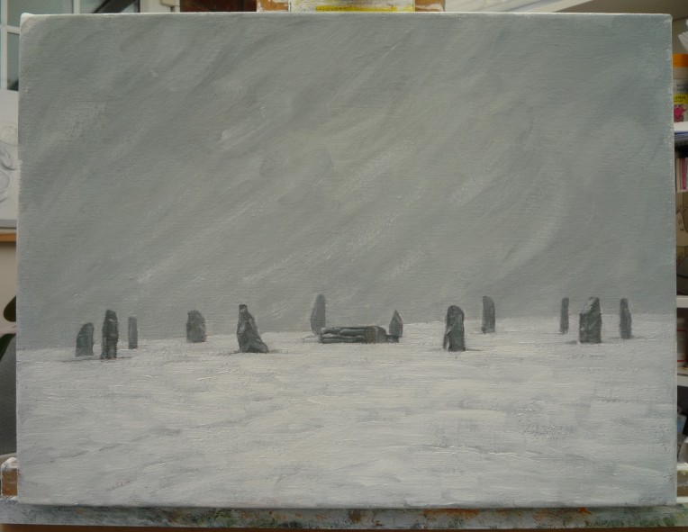
‘Castlerigg Stone Circle, 4pm, 26/10/94’
charcoal, watercolour and pastel sketch on 2 x A3 sheets (landscape)
At first, this seemed daunting – as readers familiar with this blog and my work will know, paintings are habitually made from either close, constant study of an arrangement of still life objects within a defined domestic space, or otherwise from reference to life and familiar, lived experience, supported by drawings (with the occasional photo as supporting evidence or compositional inspiration), as in the ‘woodscapes’ I have periodically painted over the last few years and to which I can refer either as I paint or otherwise pop into as and when required to confirm certain details of form, texture, colour, space, etc, as they are literally beyond the garden fence at home/studio and accessible at all times.
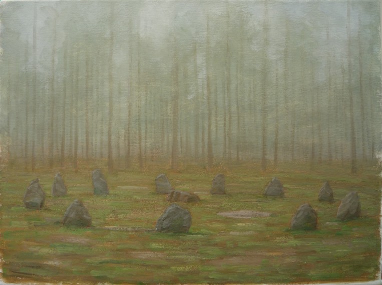
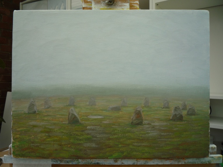
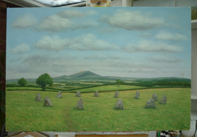
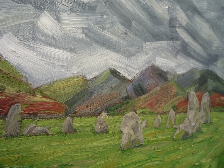
I decided to paint over an existing ‘failed’ canvas (this one, ‘Woodscape #10’), another novelty, using its texture as the first physical layer, and proceeded accordingly, to this end, a painting of a drawing of an empirical experience, the making more concrete of a memory of sorts, which might have a certain ‘hauntological’ aspect (?).
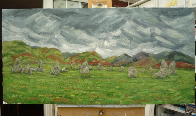
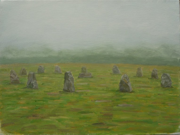
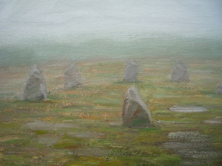
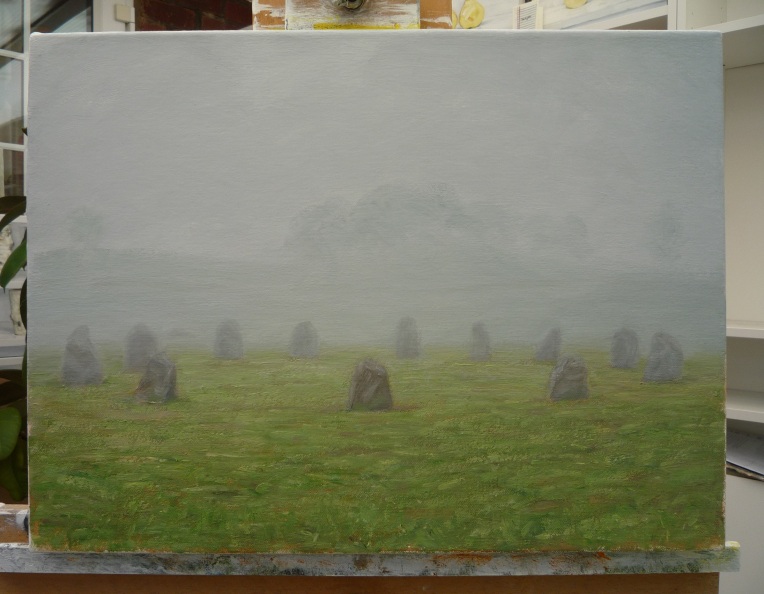
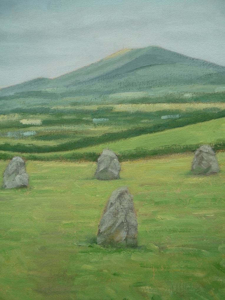
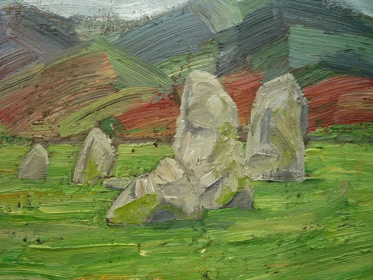
‘Castlerigg Stone Circle, after a 25 year-old sketch’
oil on canvas/50 x 100cm
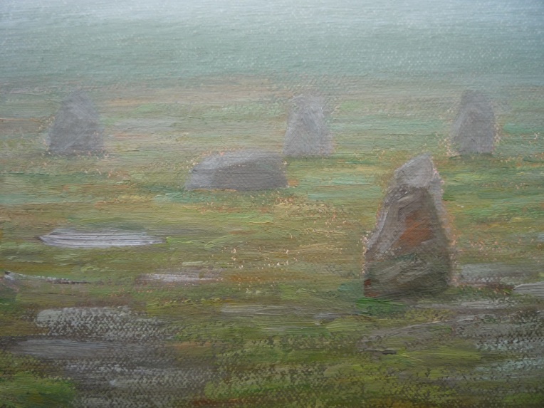
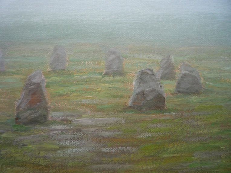
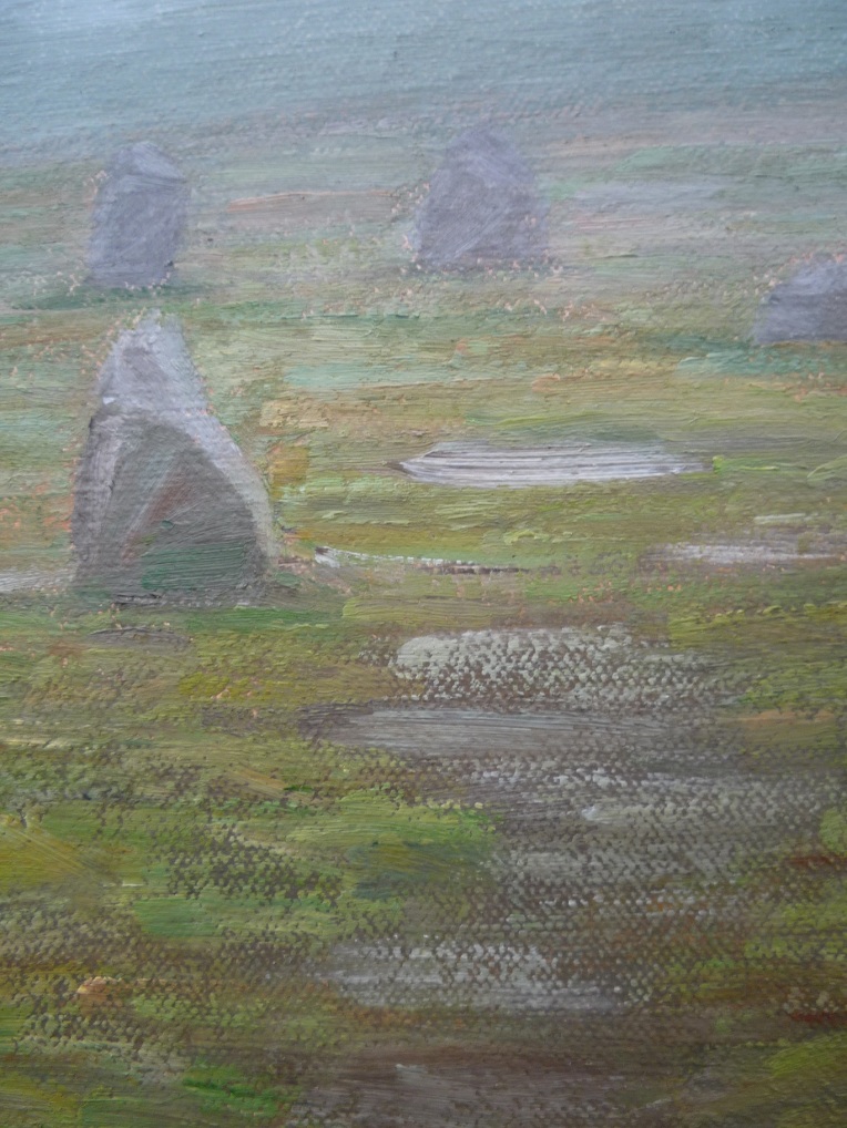
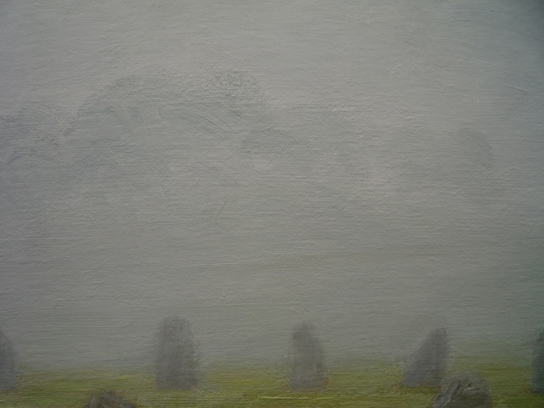
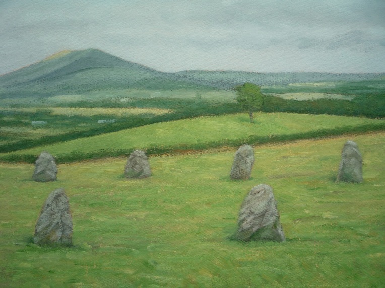
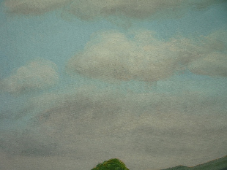
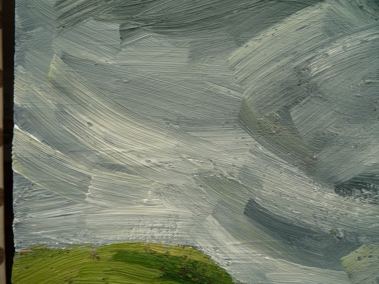
[detail]
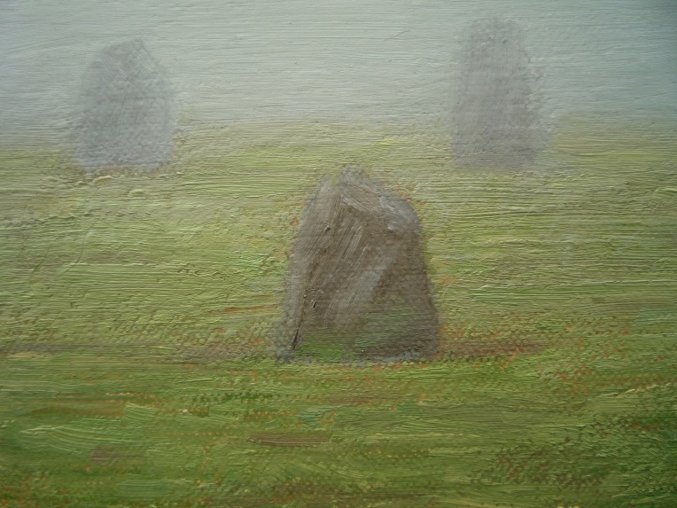
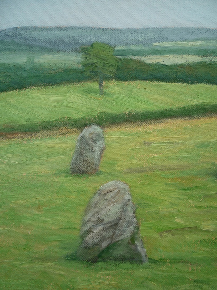
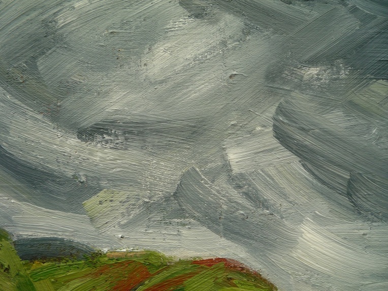
[detail]
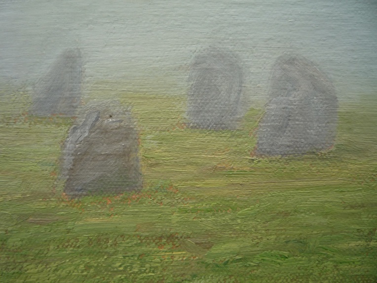
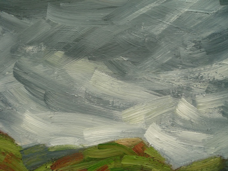
[detail]
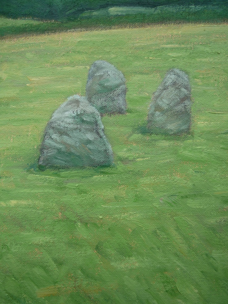
[detail]
[detail]
[detail]
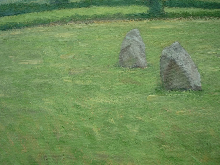
[detail]
[detail]
[detail]
[detail]
[detail]
[detail]
[detail – viewed from left-side angle]
[detail – viewed from right-side angle]
[detail – viewed from right-side angle]
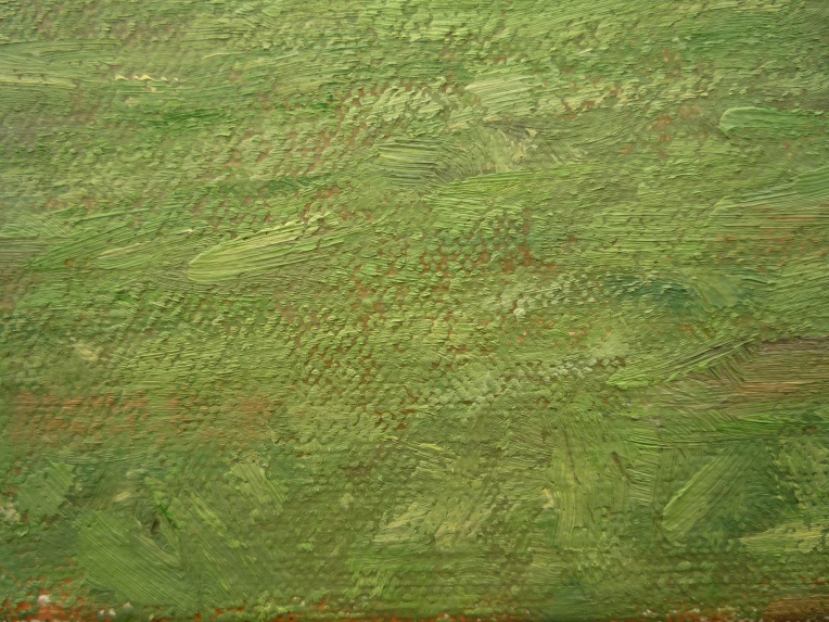
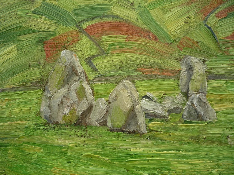
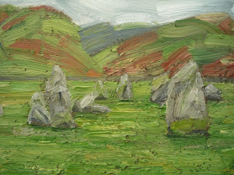
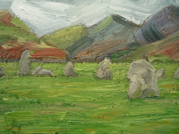
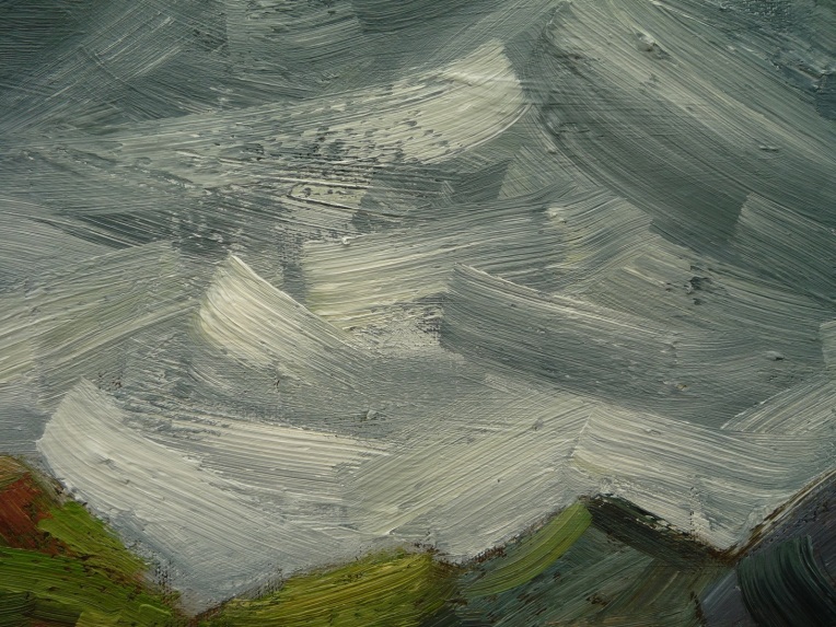
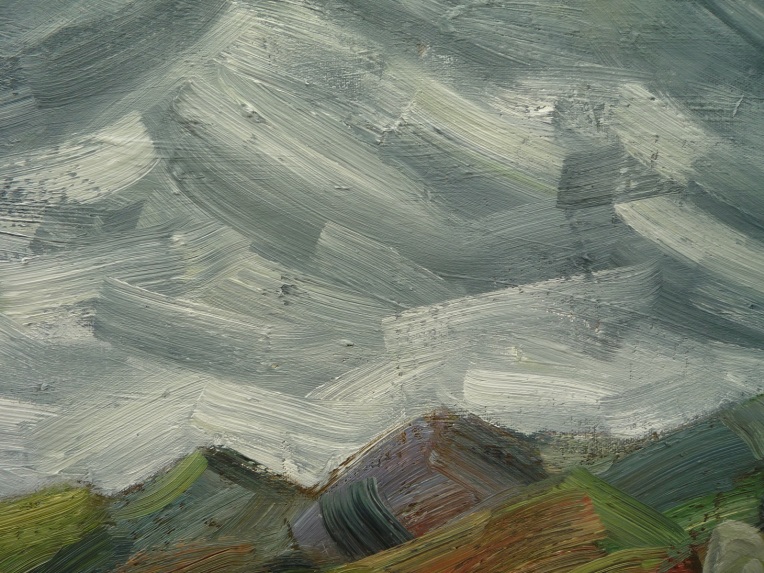
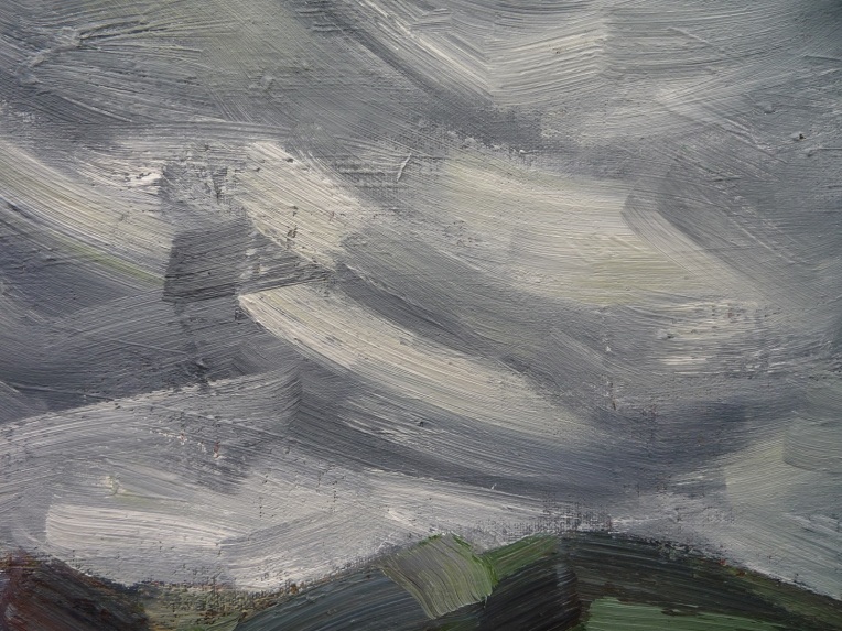
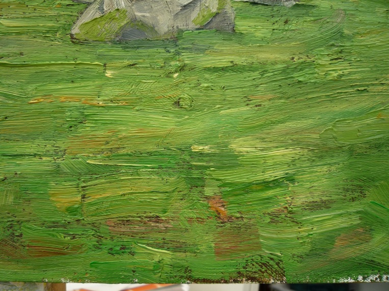
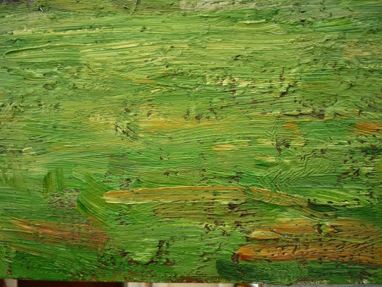
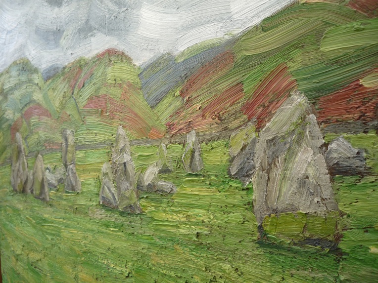
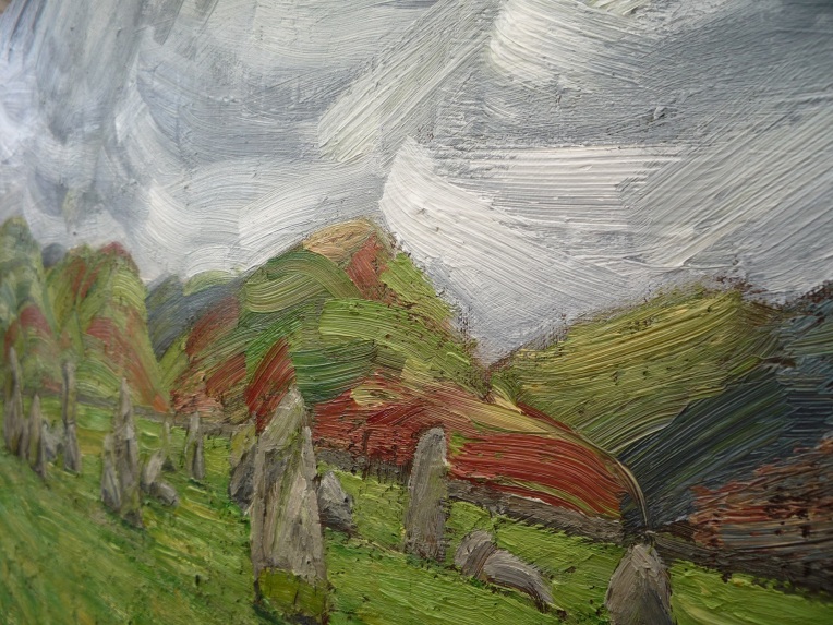
As ever, communication of the physicality of the medium and the means of its application are a primary concern, and landscape, especially featuring such objects as standing stones, seems a most appropriate vehicle to do this, particularly having to contend with the underlying texture of the already painted surface, encouraging the making of lovely buttery marks of oil paint.
This might be a one-off or lead to continued experiments of the kind, either in terms of stone circles as subject matter or old drawings as source material, or indeed both, but first, another still life beckons – although, somehow, there seems something very like a still life, albeit an exterior one, about a stone circle when I look at this painting.